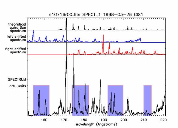
The routine ghost_plot_one can be used to display the ghosted regions in the GIS data for one detector only (use ghost_plot_all to see information on all 4 detectors). It reads the Quick Look Data Structure (qlds) format and plots the following:
- Blue shifted spectrum (a copy of the observed spectrum shifted to shorter wavelengths by one spiral arm)
- Red shifted spectrum (a copy of the observed spectrum shifted to longer wavelengths by one spiral arm)
- Likely ghosted regions
The suggested use is:
IDL> qlds = readcdsfits('s10716r00')
IDL> gis_smooth, qlds
ghost_plot_one, qlds, 1, /sample, /angstroms
The following plot is returned:

The plot shows:
- Theorectical quiet Sun spectrum (top plot).
This theoretical spectrum is called with the /sample keyword. There are a number of warnings that come with the sample spectrum, see xdoc, 'ghost_plot_sample' for details. The spectrum is intended only as an aid to ghost restoration and the intensities of lines are only approximate.
- Left shifted spectrum.
The spectrum plotted is a copy of the observed data, but shifted to the left by one spiral arm. Any ghost that occurs can only be from an original line one arm to the left or to the right. As the ghosting scale is not linear, the amount of shift varies across the detector.
- Right shifted spectrum
This a copy of the observed data shifted to the right by one spiral arm.
- Spectrum (bottom)
The lower part of the plot contains a summary of the data, where all the exposures in the observation have been added together. The purple boxes show information from the `ghost information files' where the ghosts are expected to be located. The vertical scale is in arbitrary units to show most of the lines, but to enhance the weaker lines plot with logscale.
If the /cross_cor keyword is used, the correlation between the original and blue and red shifted spectra is displayed. If the absolute cross correlation coefficient is greater than 50% it plots a thick bar. This is only a guide to where ghosts may be located, and is easily confused by line blends. By default the correlation is not plotted.

